nu miami forum
Brand Identity and Marketing Collateral for a Music Venue in Miami
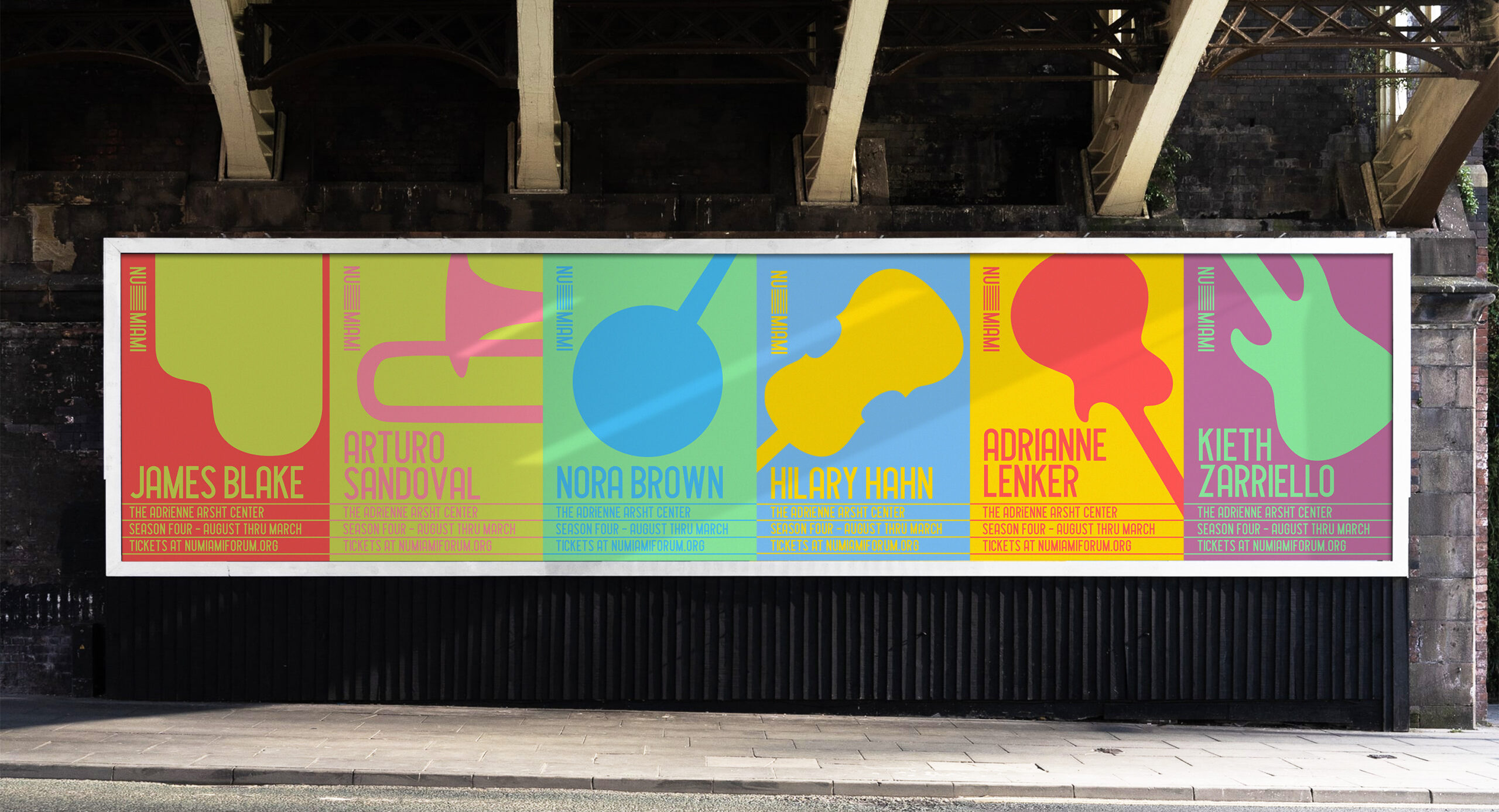
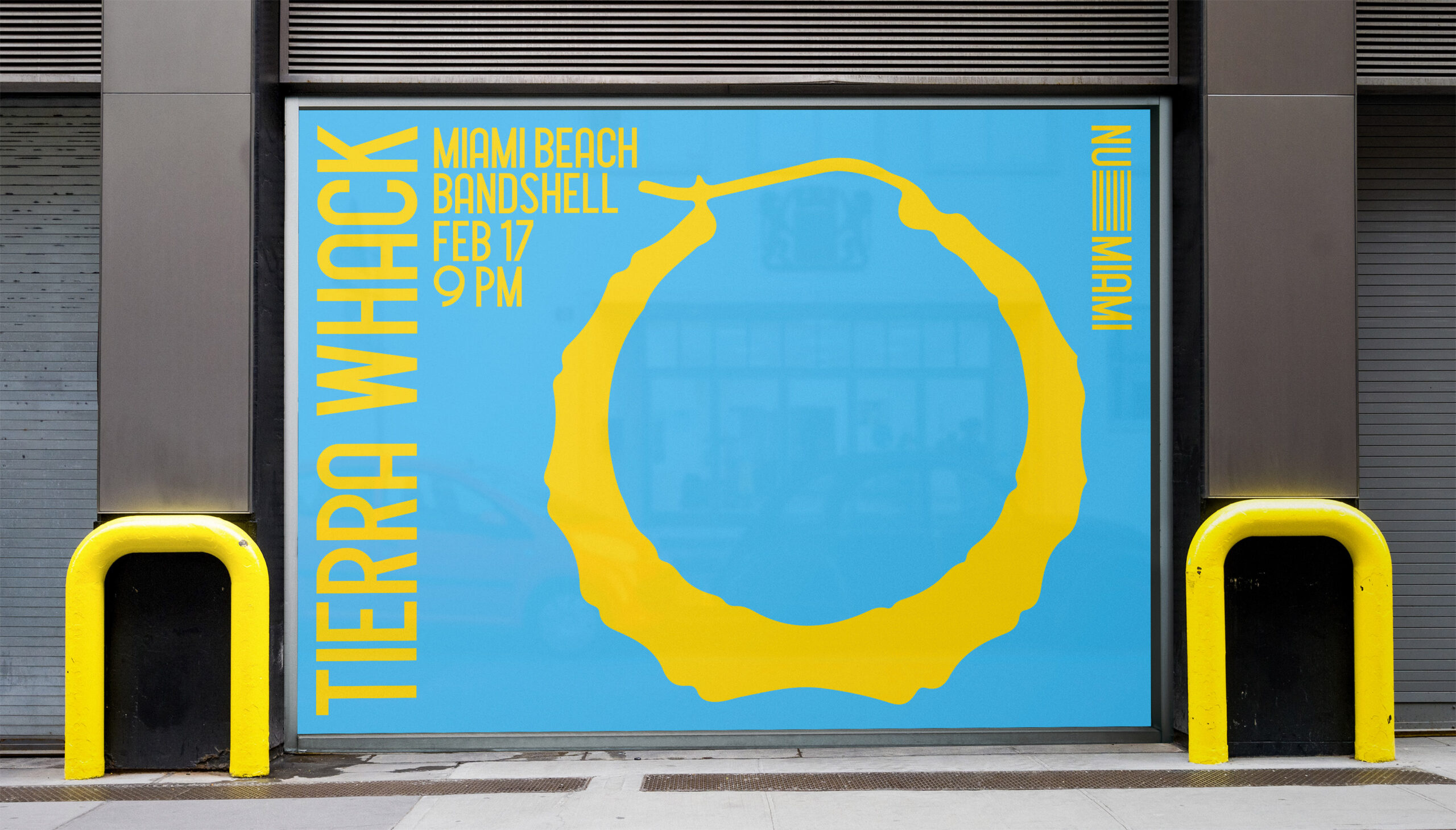
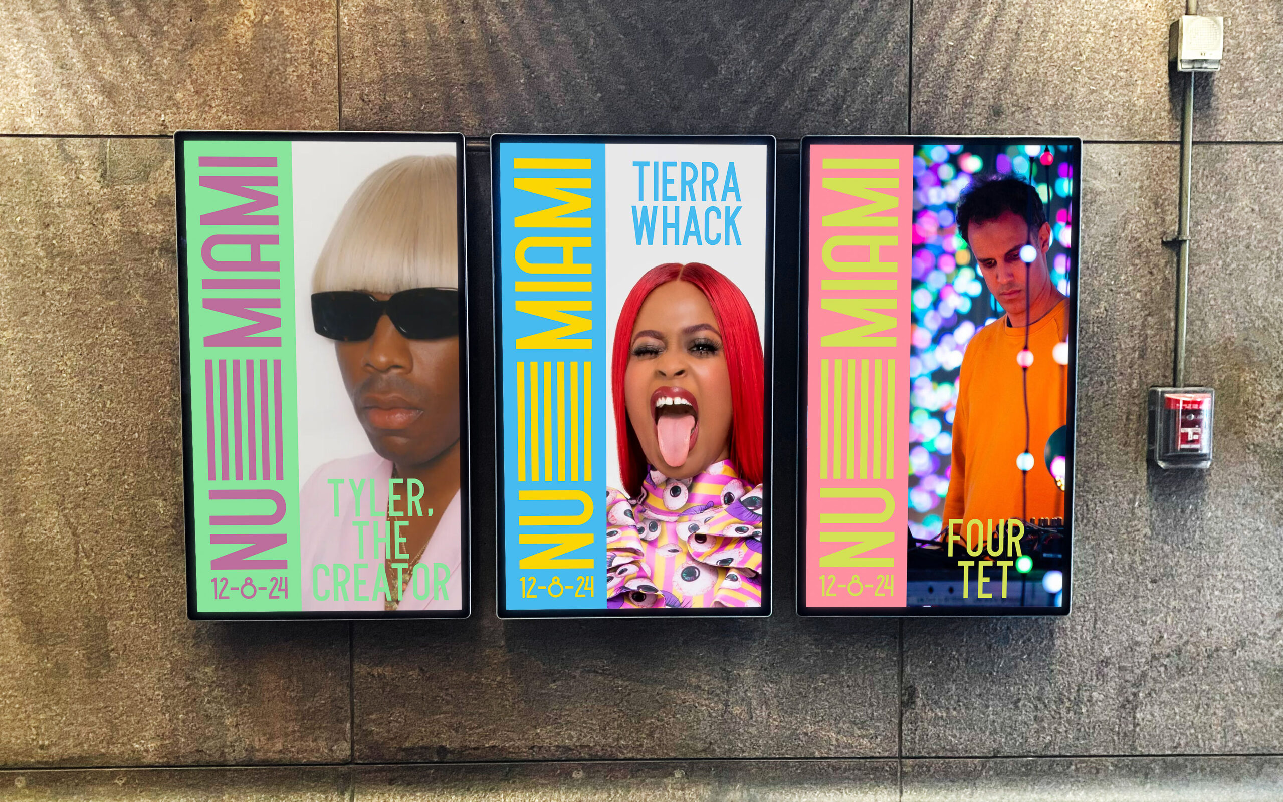
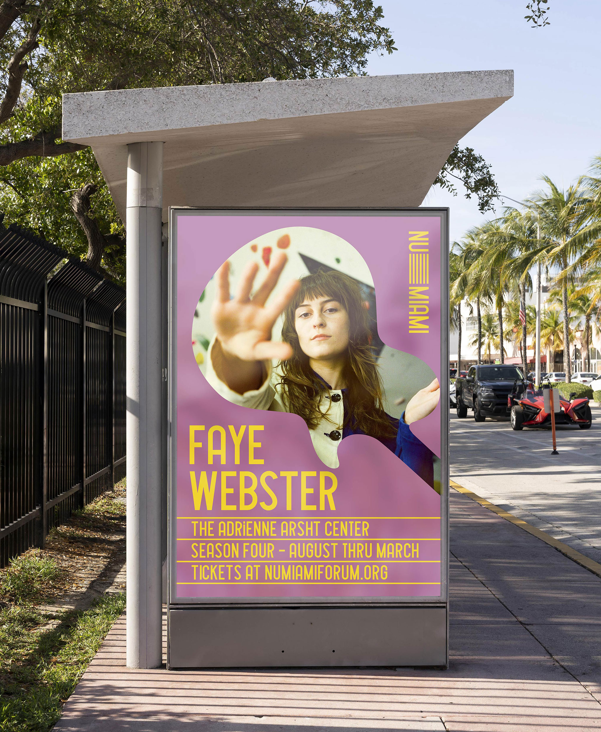
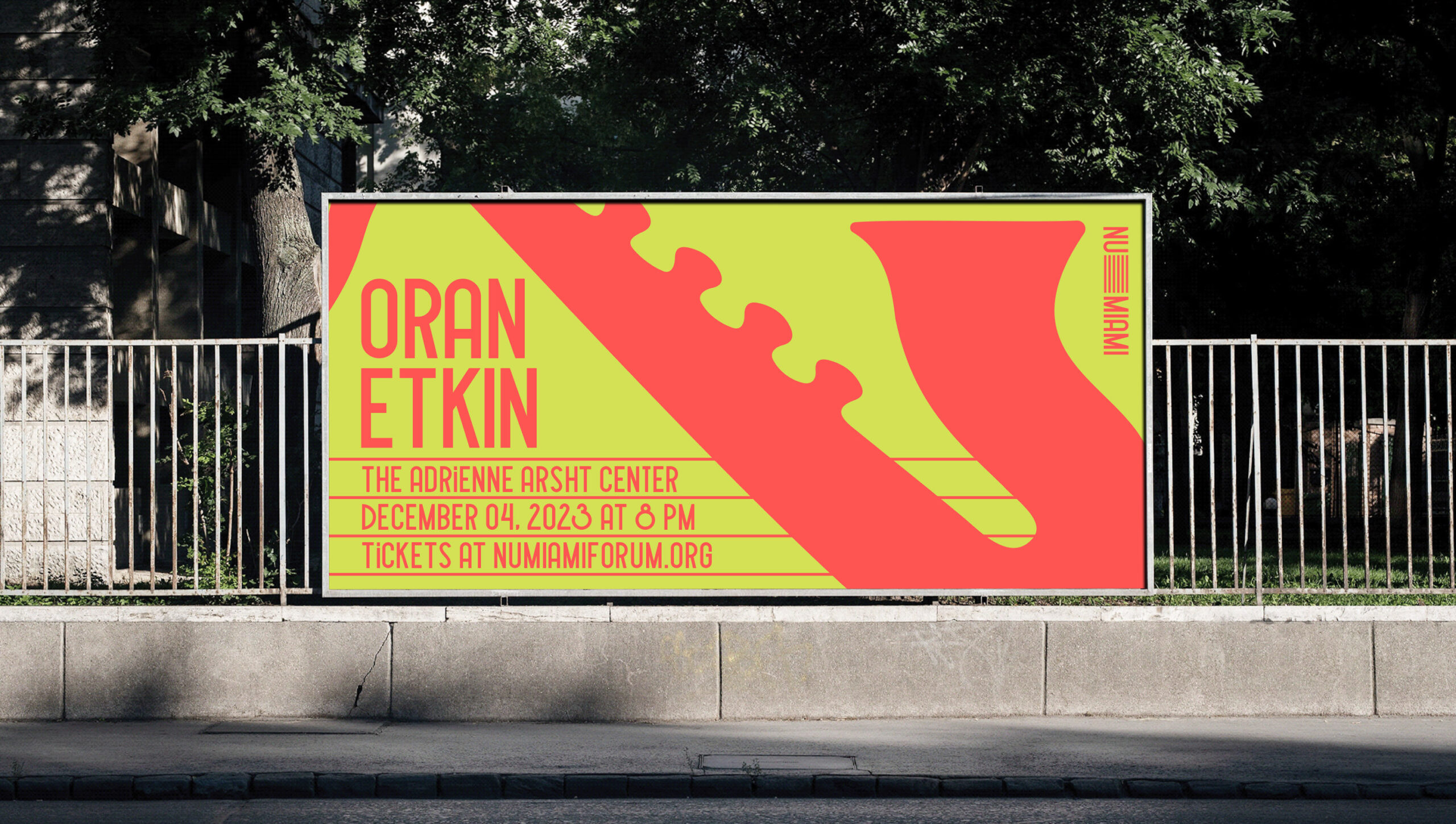
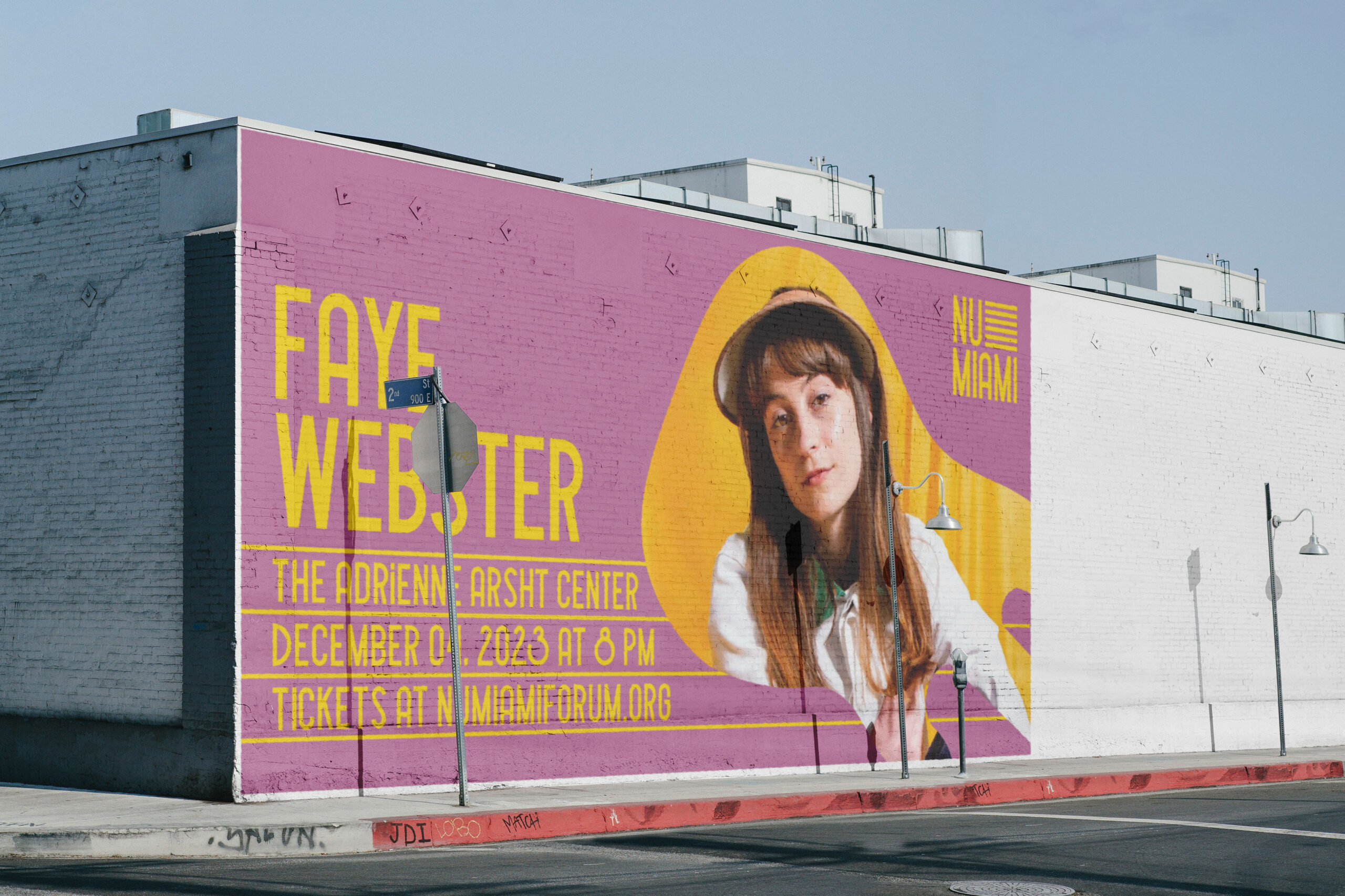
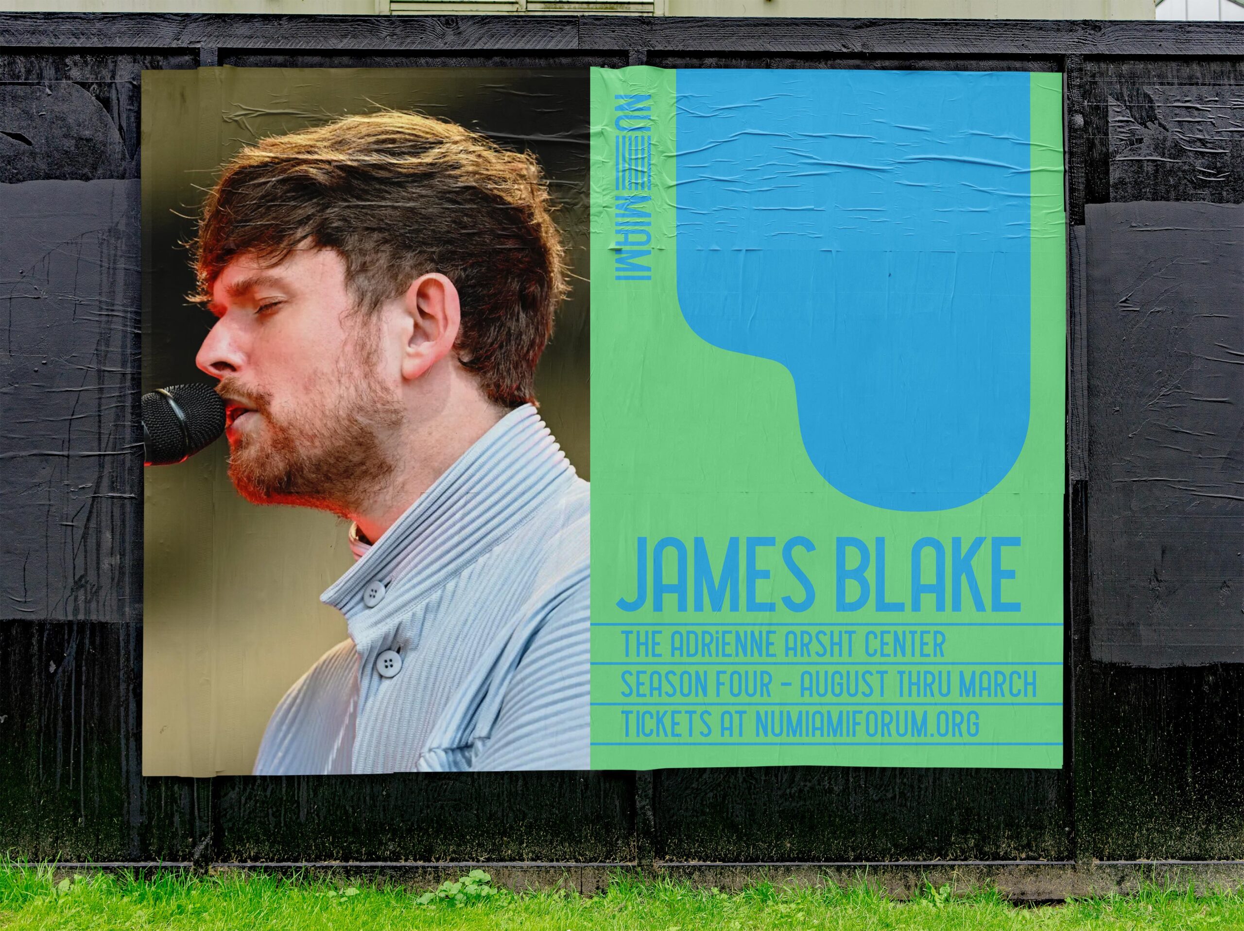
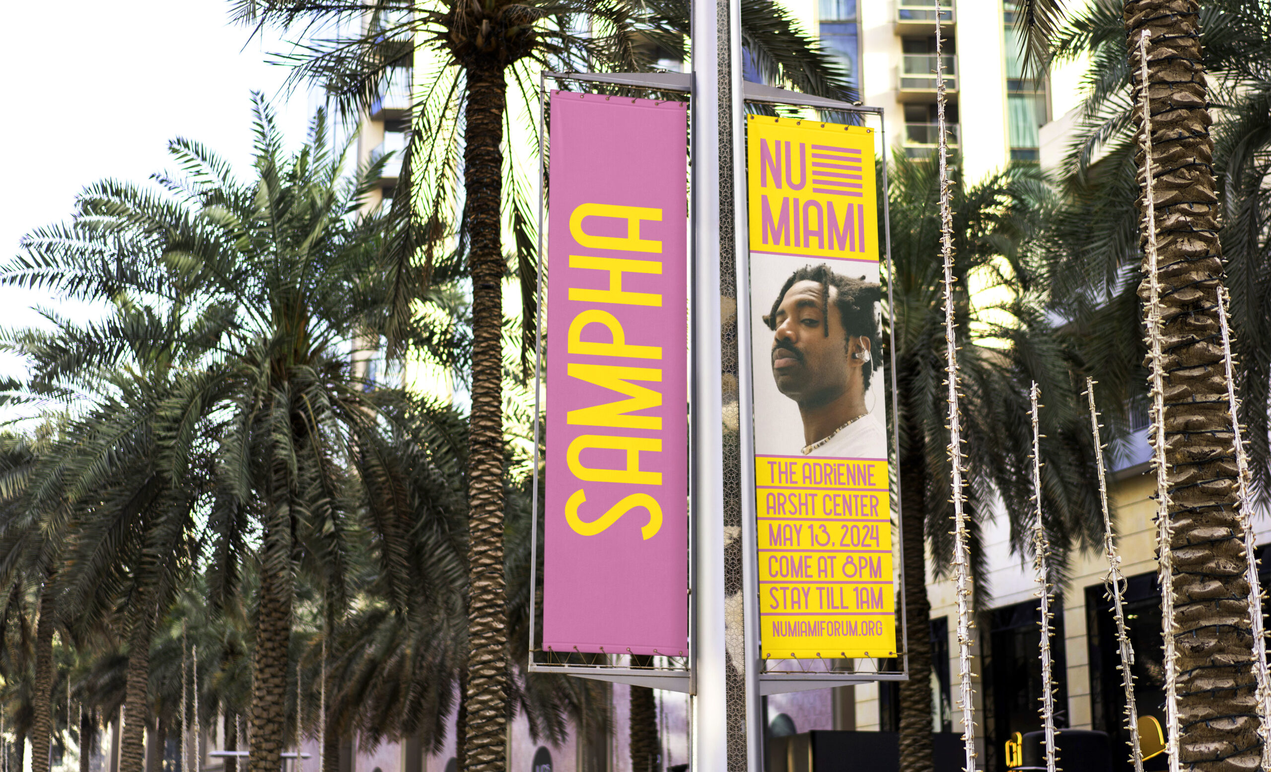
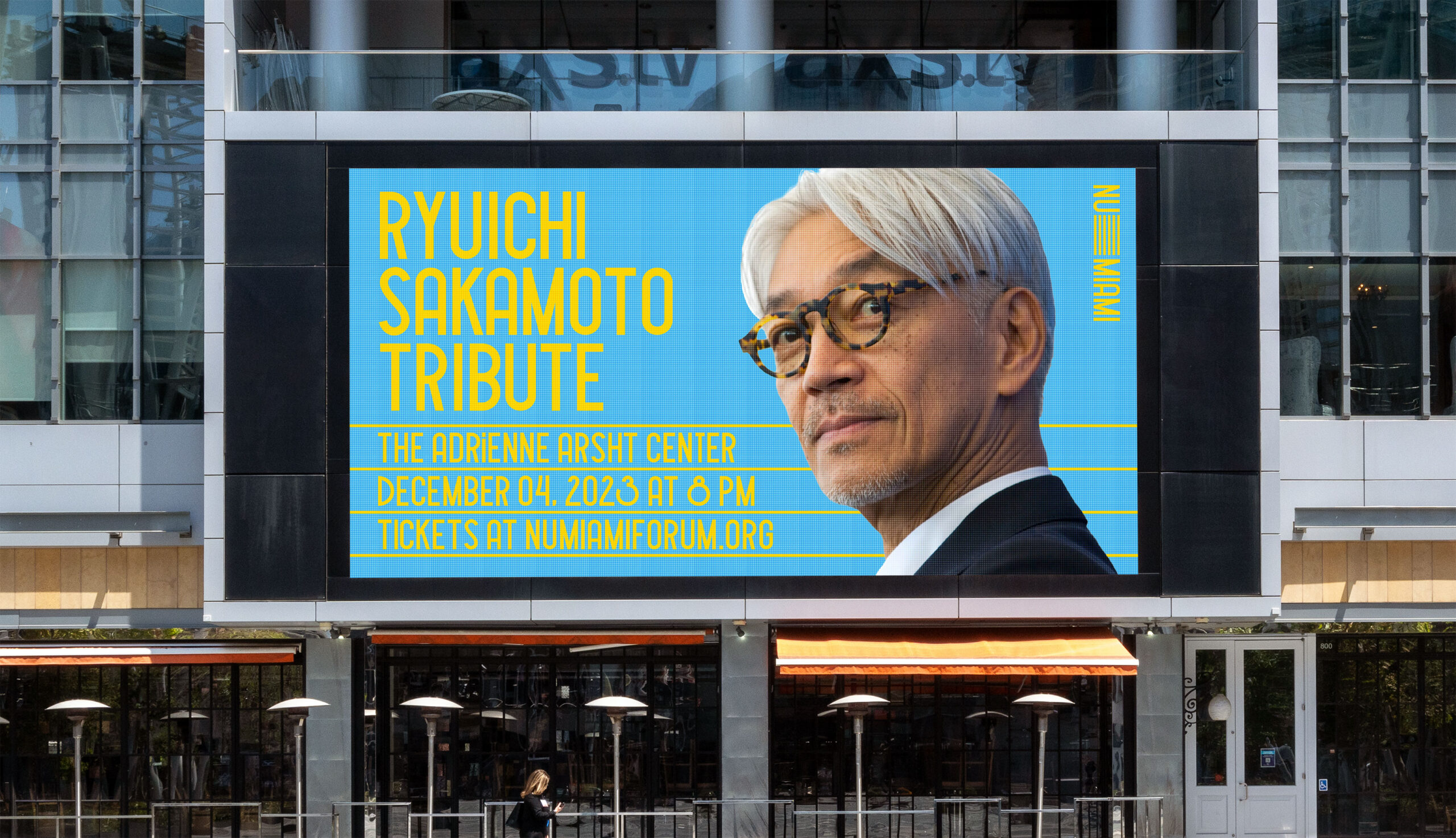
The visual identity for Nu Miami Forum was developed to spotlight a music venue that hosts a series of annual concerts by emerging artists. Our goal was to create a flexible and adaptable branding system that seamlessly works across various marketing channels. This identity comes to life in a series of advertisements and promotions for upcoming shows, with the featured talent of each event taking center stage in every marketing piece.
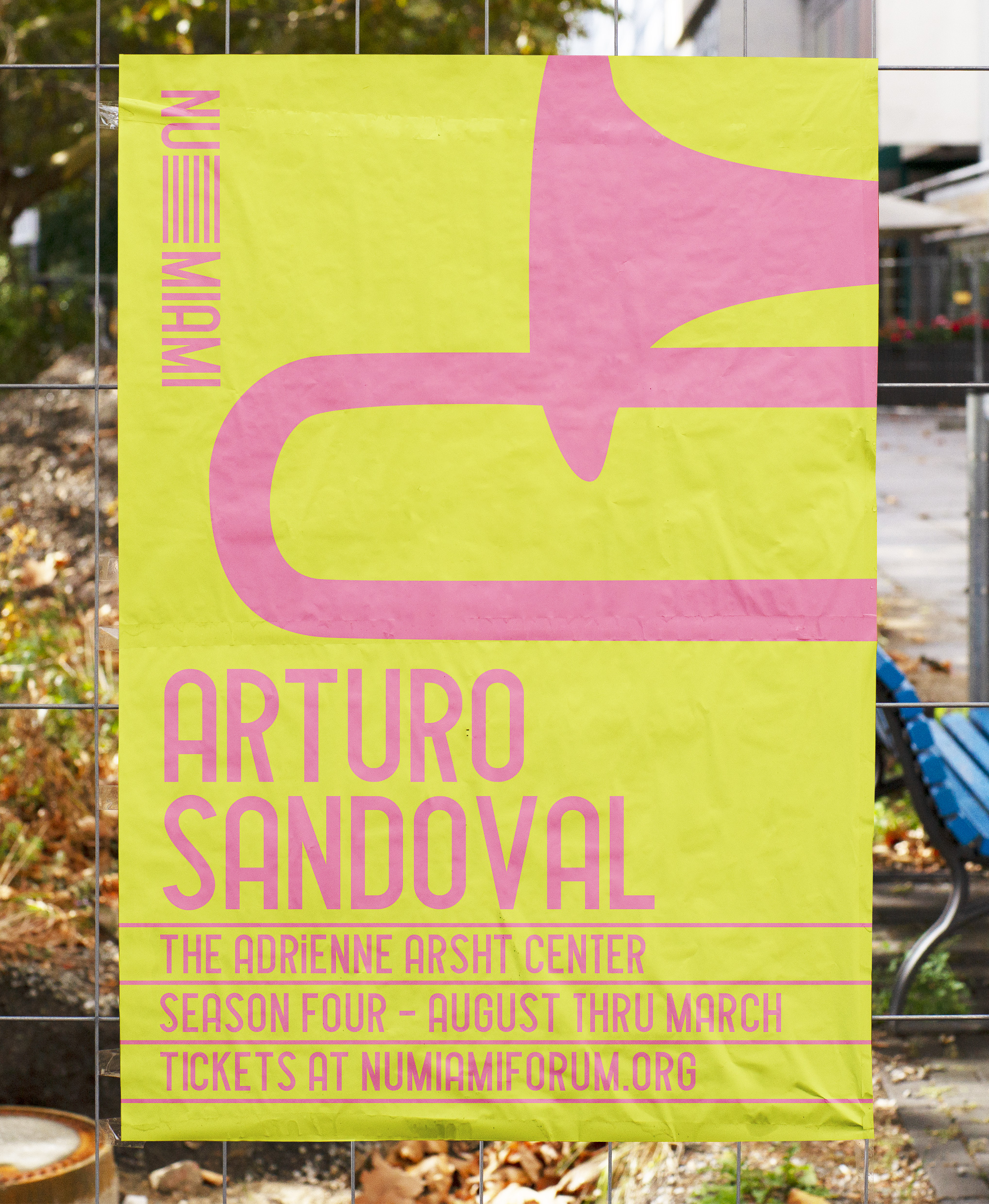
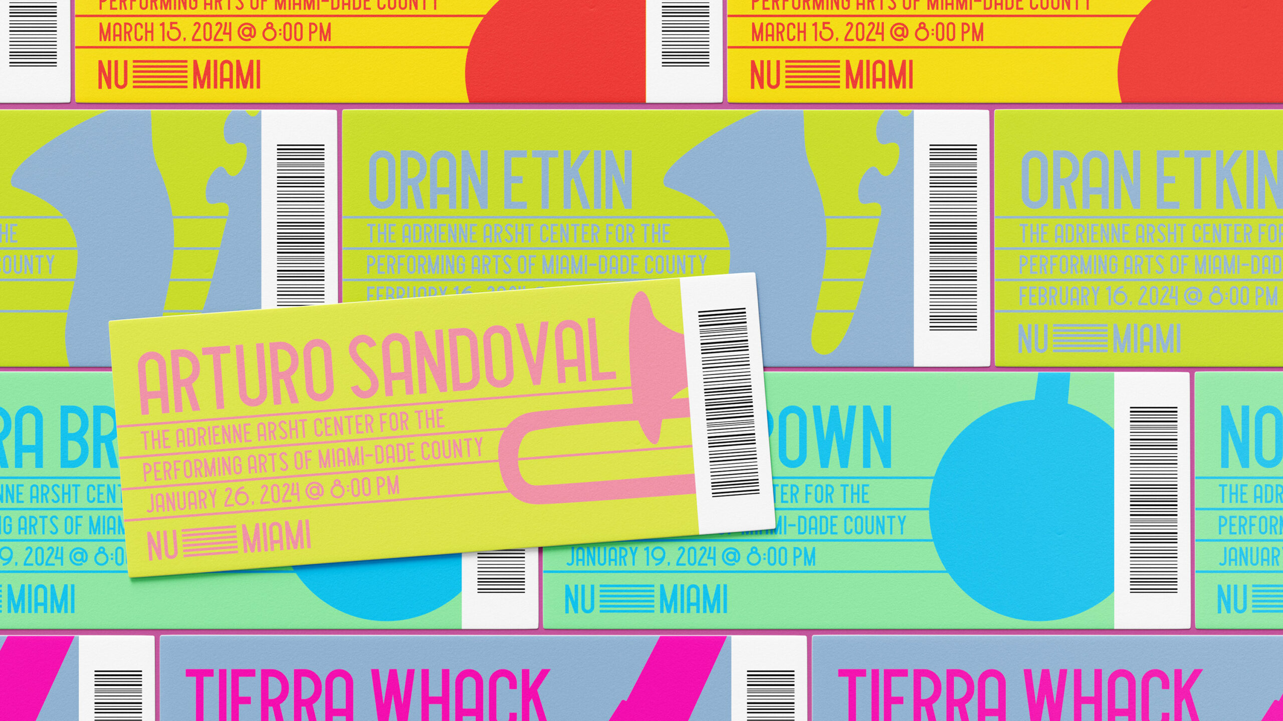
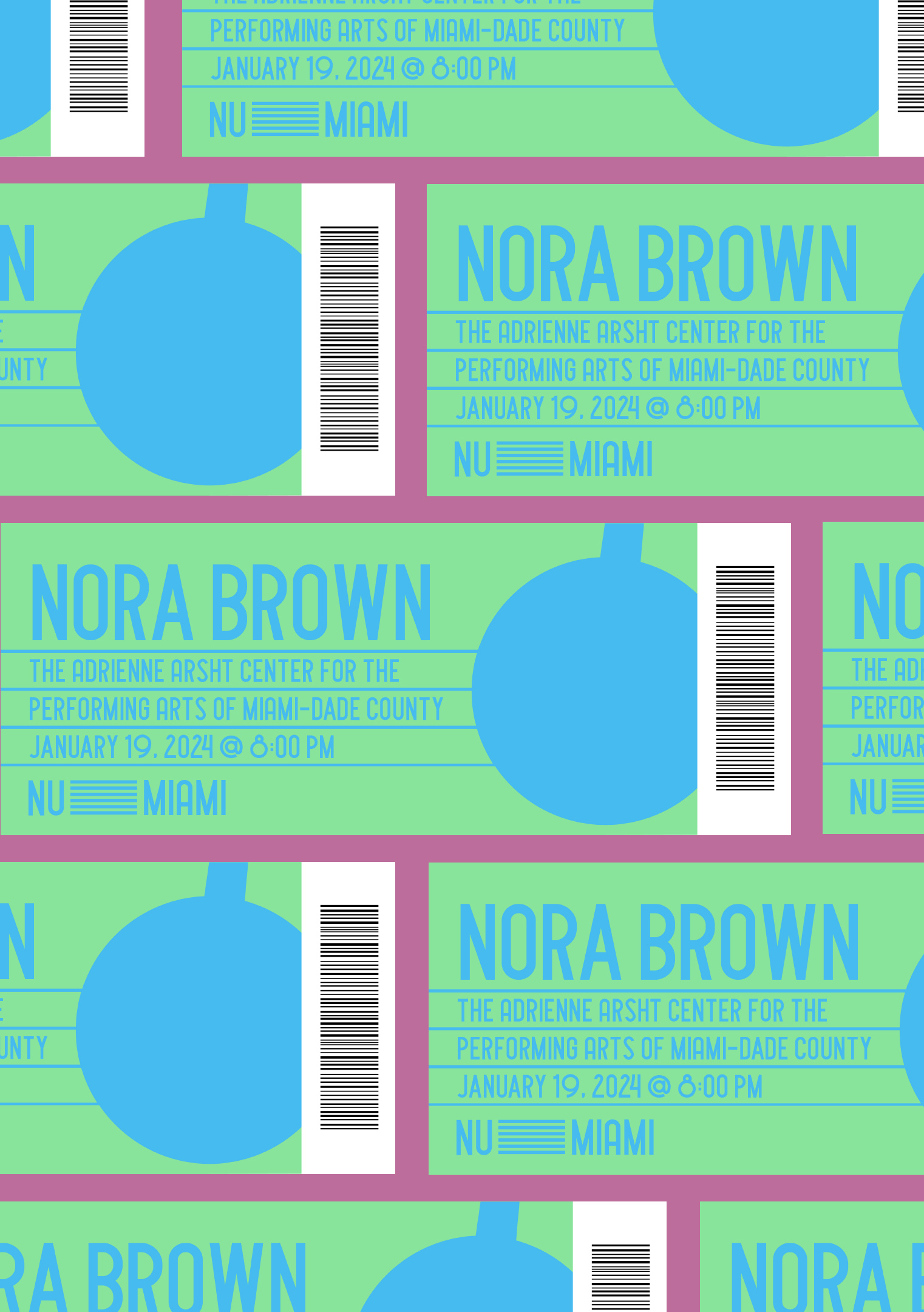
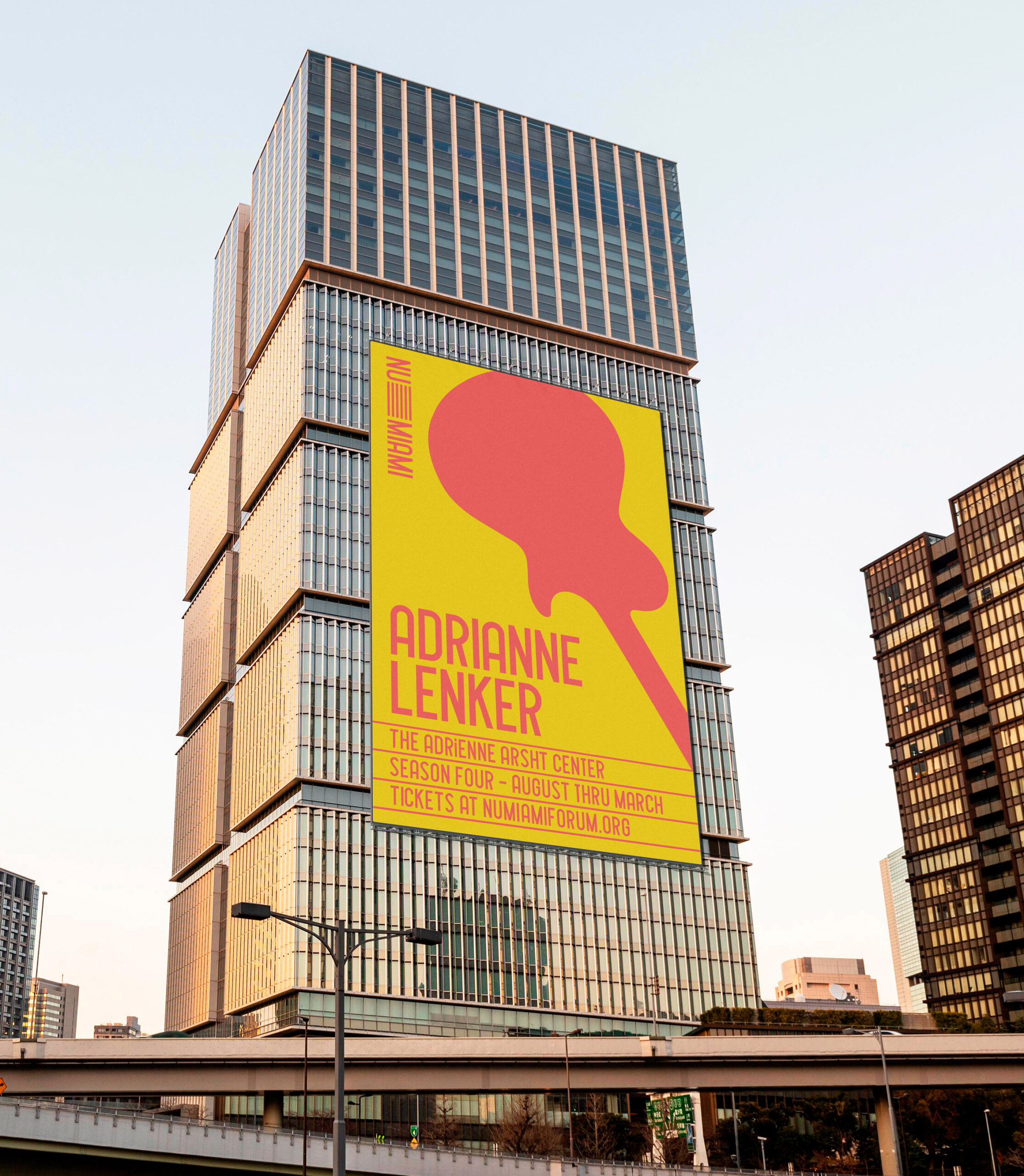
At the core of the design are three key elements: shapes, lines, and color, all unified by a single typeface. Each element serves dual purposes—conveying meaning and making things adaptable for practical use. For instance, the shapes are simplified instrument silhouettes that represent the musical genre of the event while also acting as color blocks to make text stand out. The lines, inspired by sheet music, also help lay out event details about upcoming shows and calls to action for ticket sales. The wordmark is integrated with these lines, which are dynamic and always in motion, expanding and contracting with the fluidity of an accordion or a conductor's baton.
Ultimately, the visual language is fun and vibrant, capturing the essence of Miami while remaining clear and legible—perfect for communicating event details and driving ticket sales. Most importantly, it shines a spotlight on the talent at the heart of each event.

