Alamore
Brand Identity and Packaging for a Fruit Liqueur Maker and Retailer
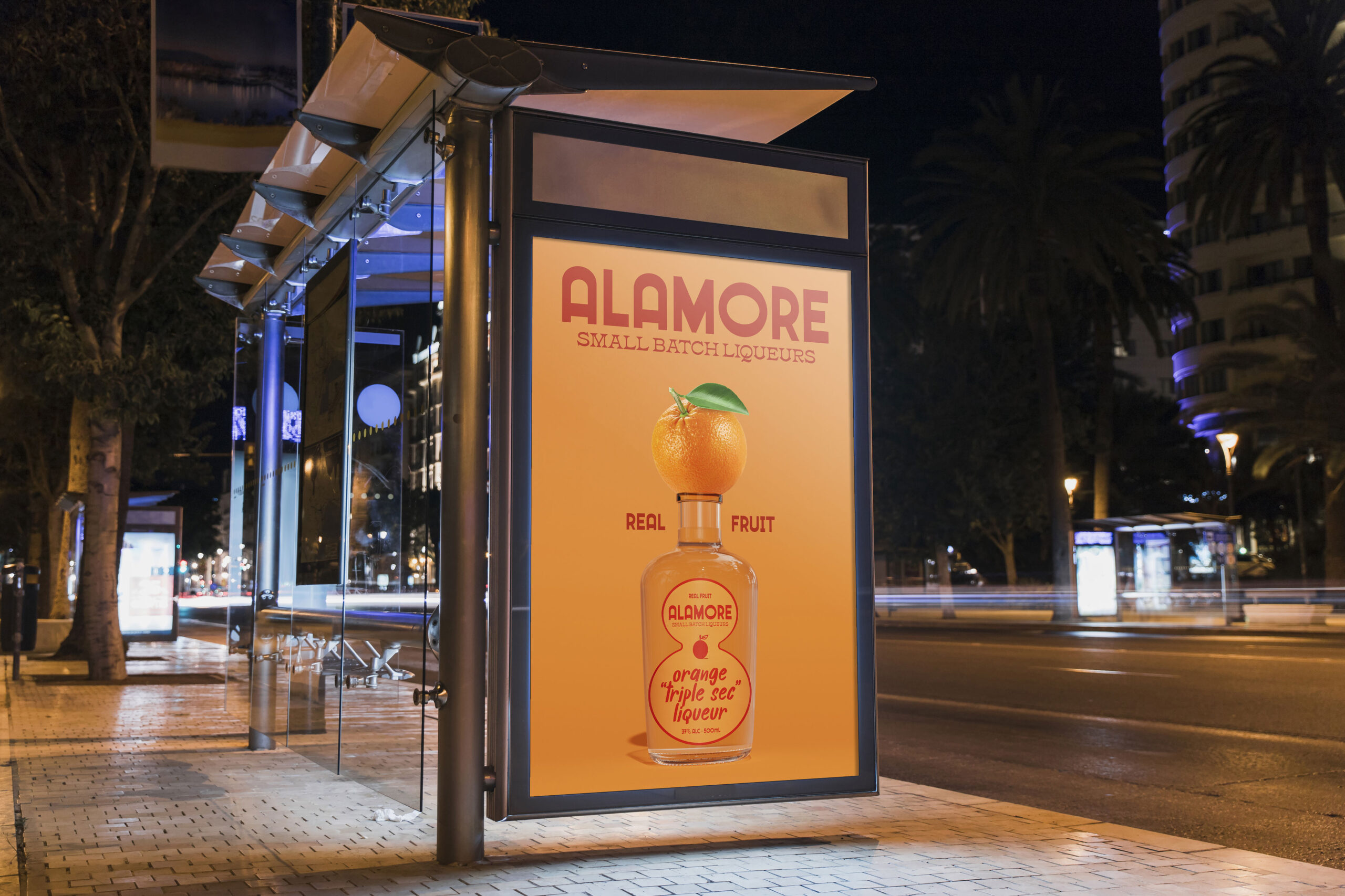
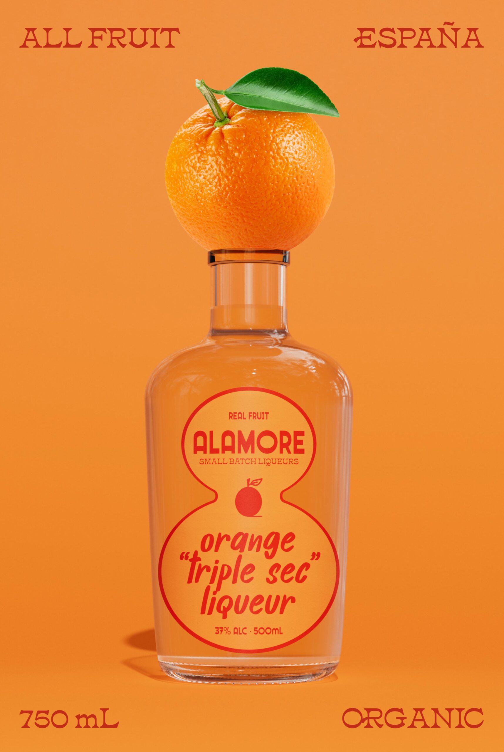
The packaging for Alamore Liqueurs is simple by design. We opted for straightforward design choices throughout. The product is produced and packaged in a small town in Spain, where the simple pleasures of life reign supreme.
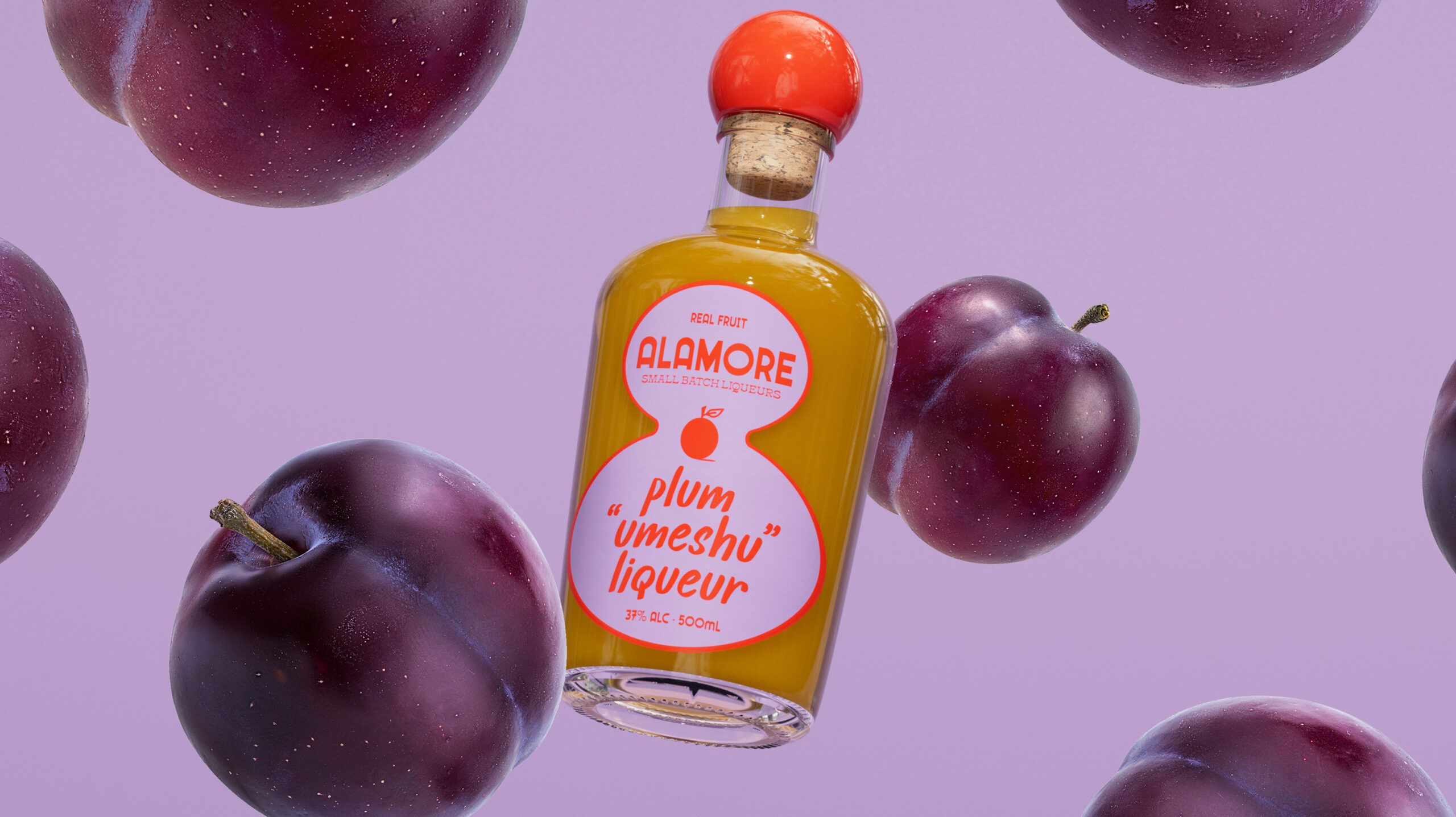
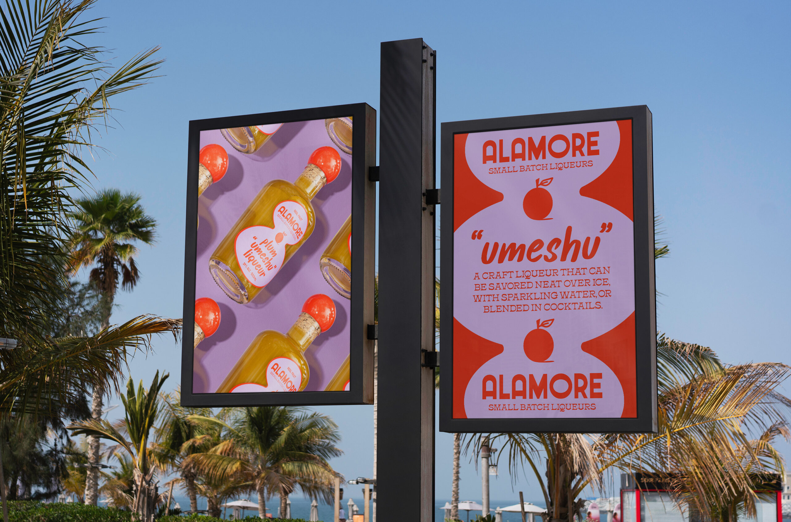
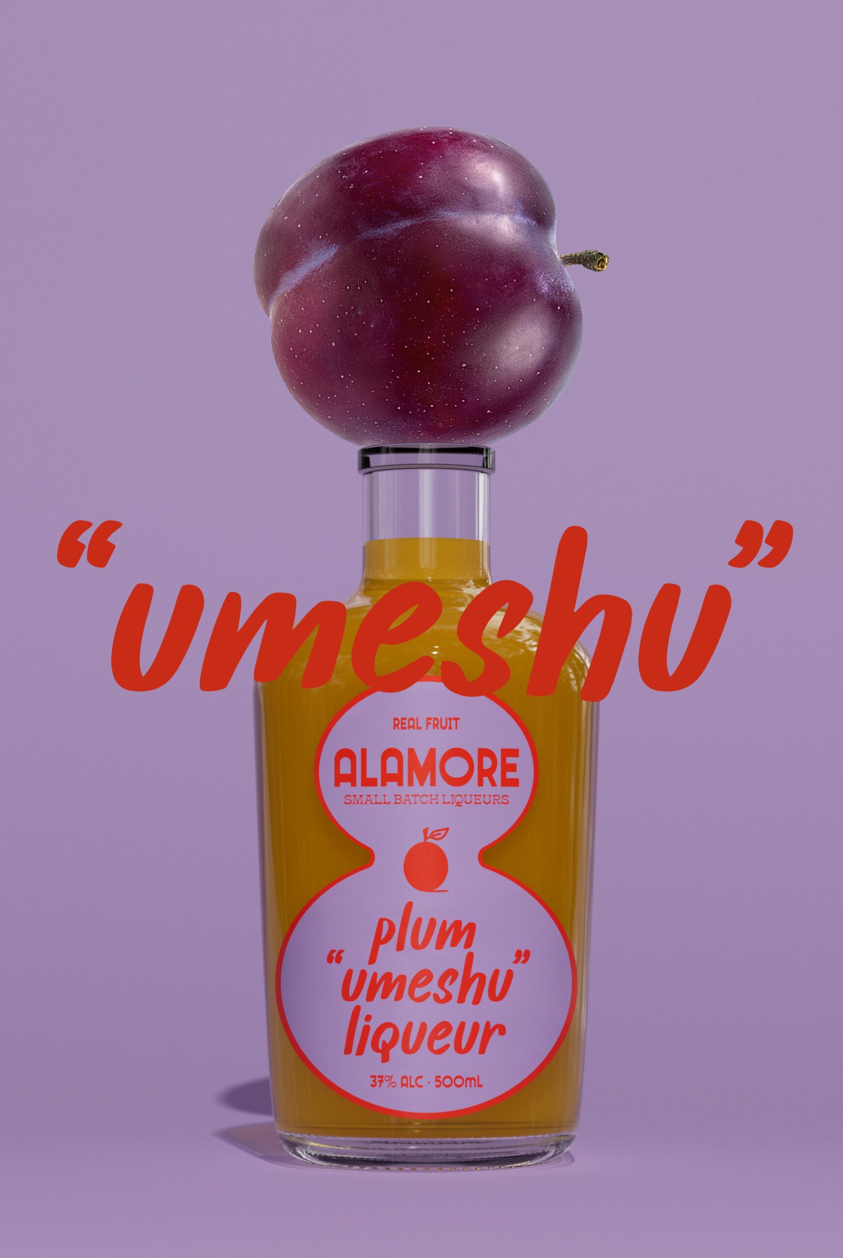
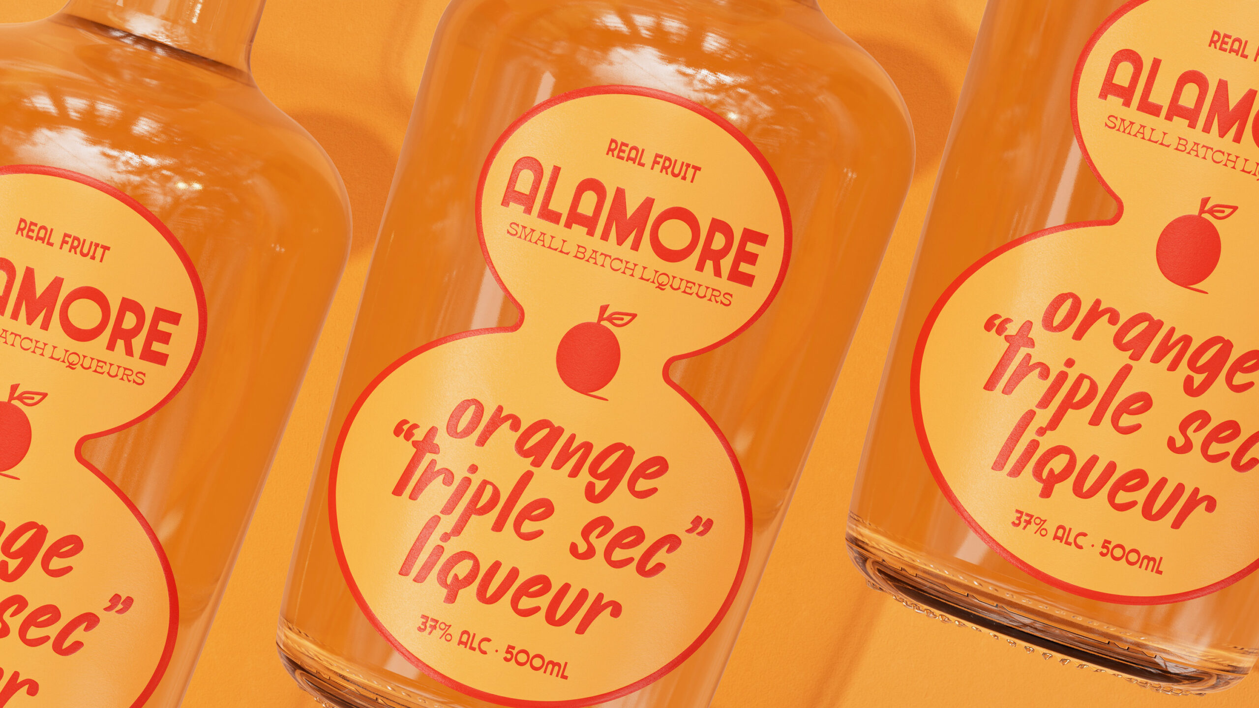
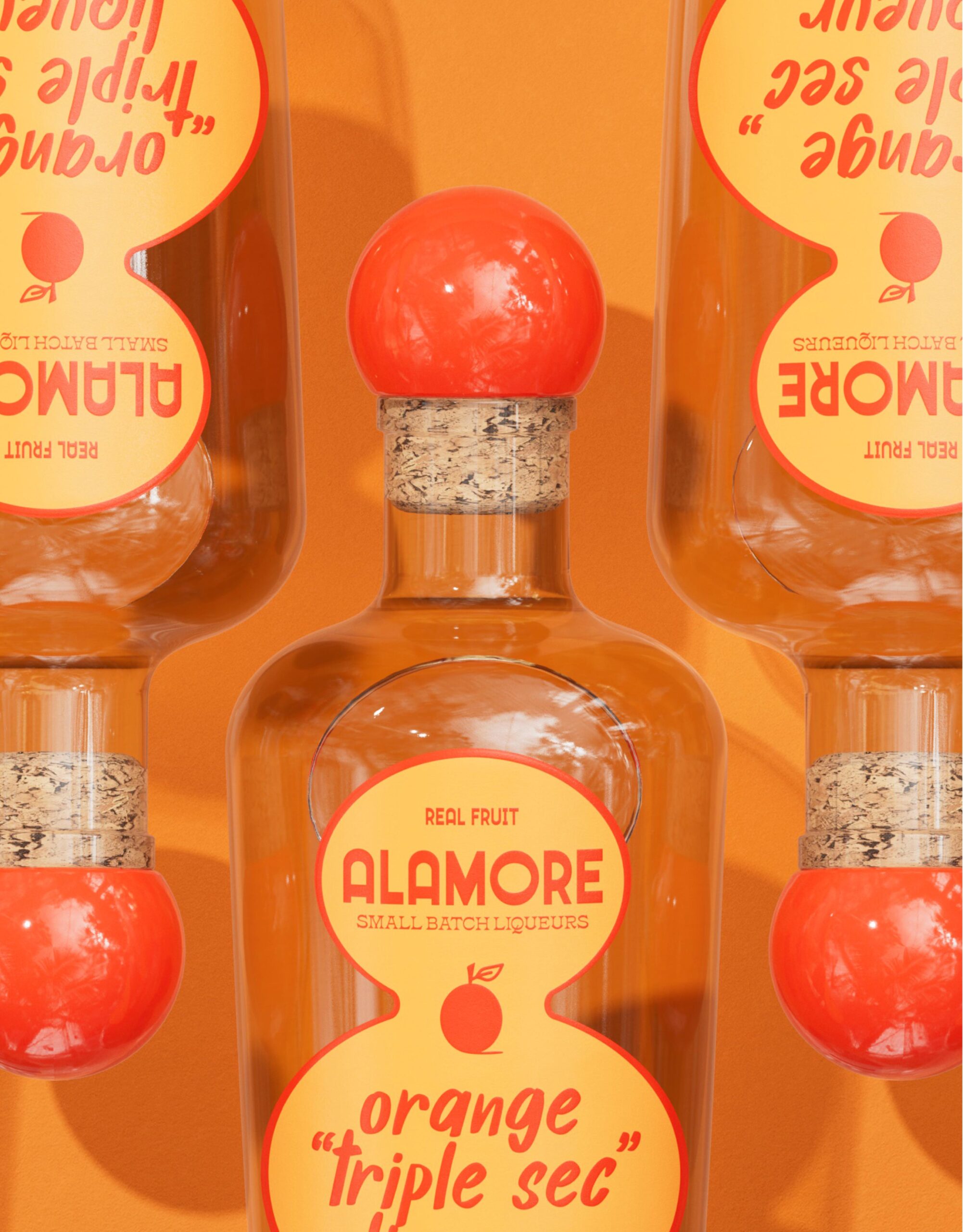
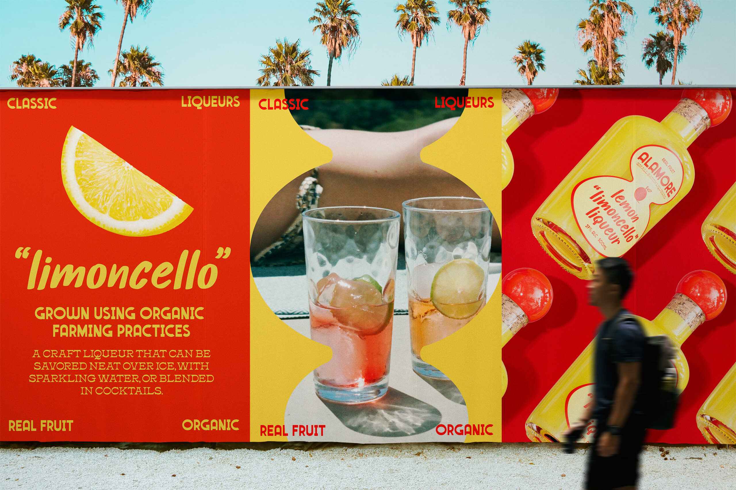
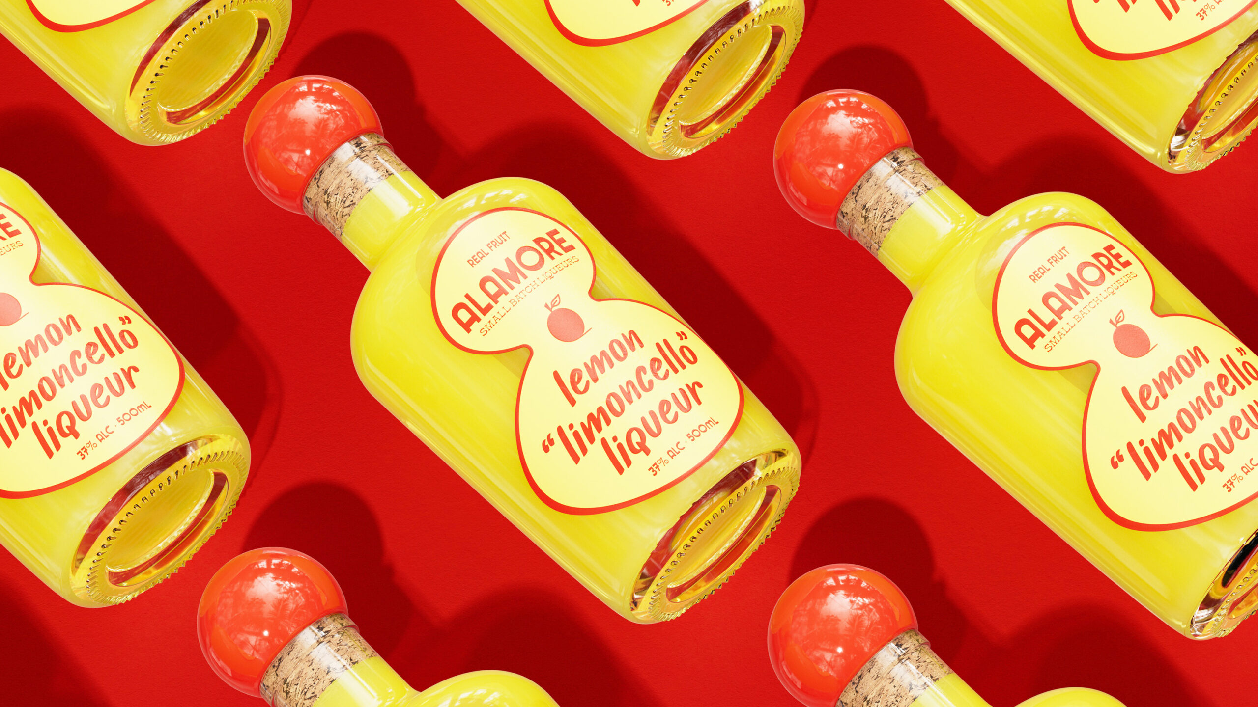
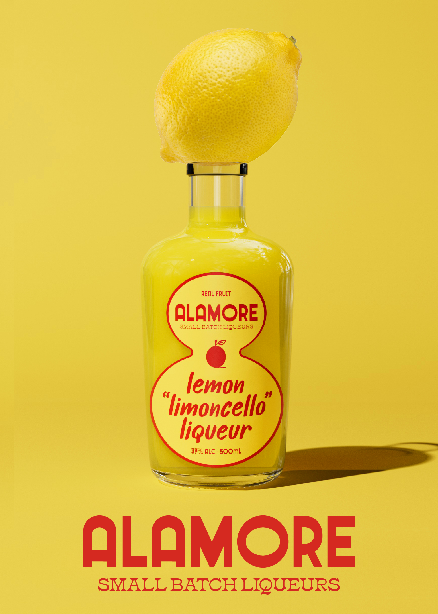
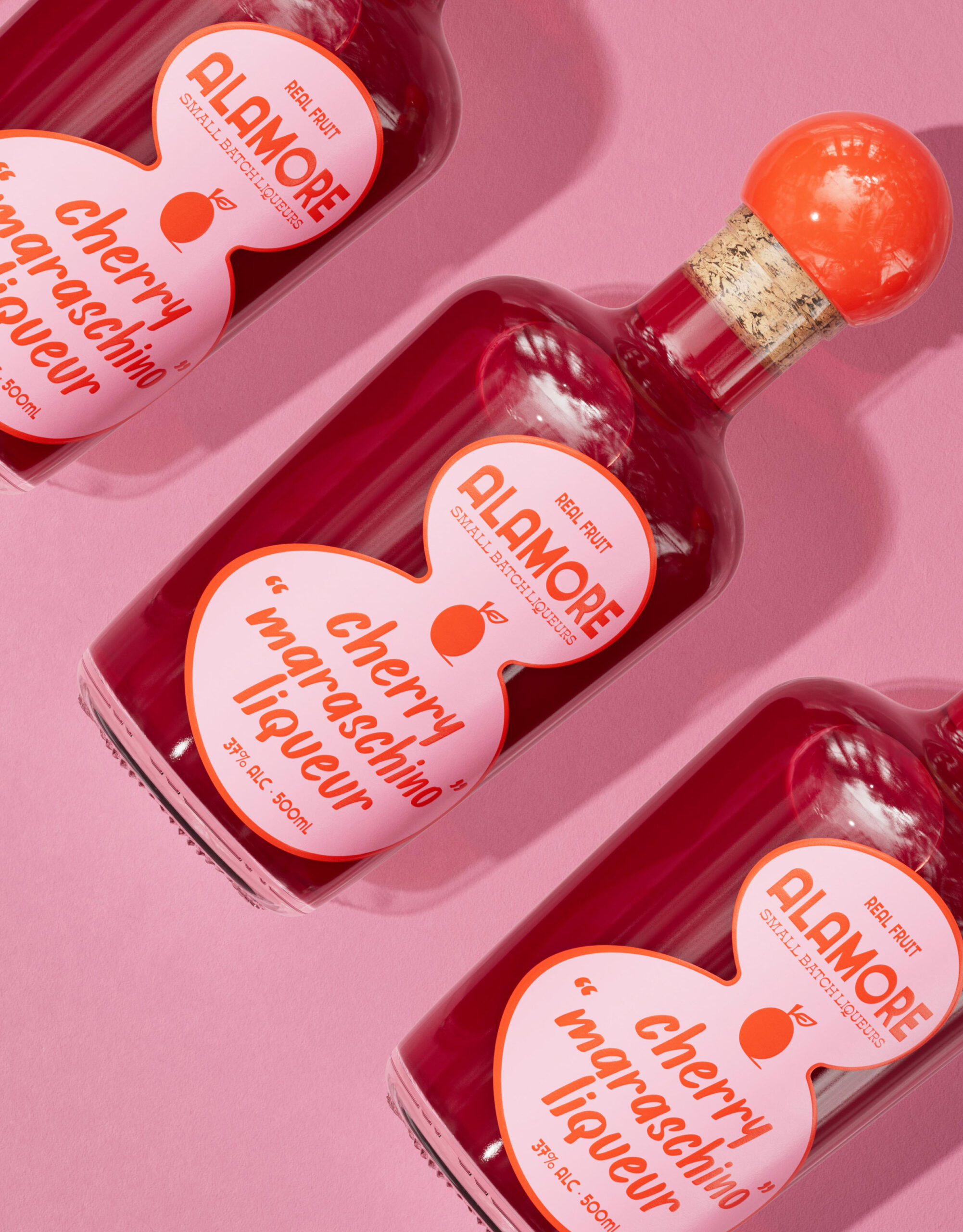
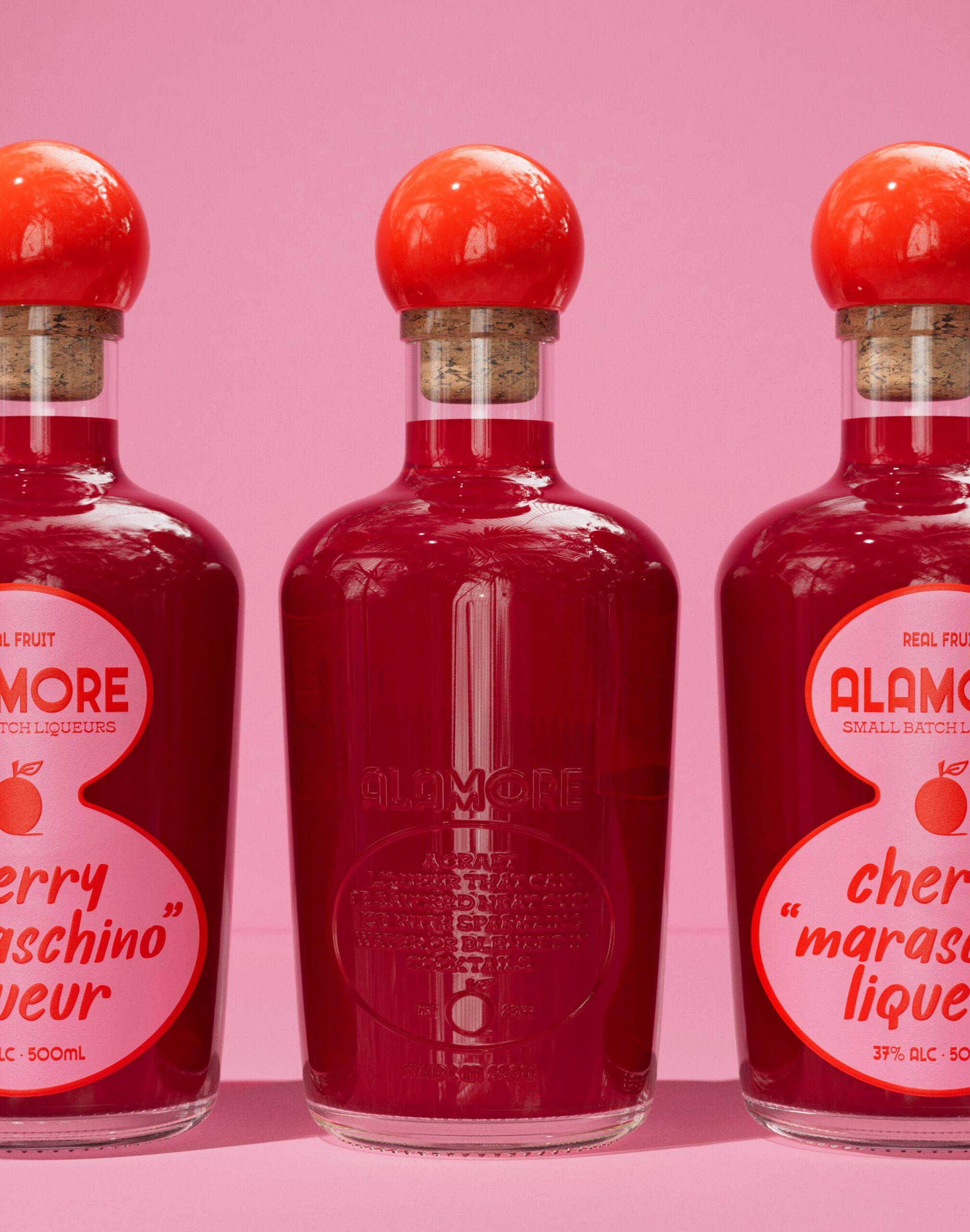
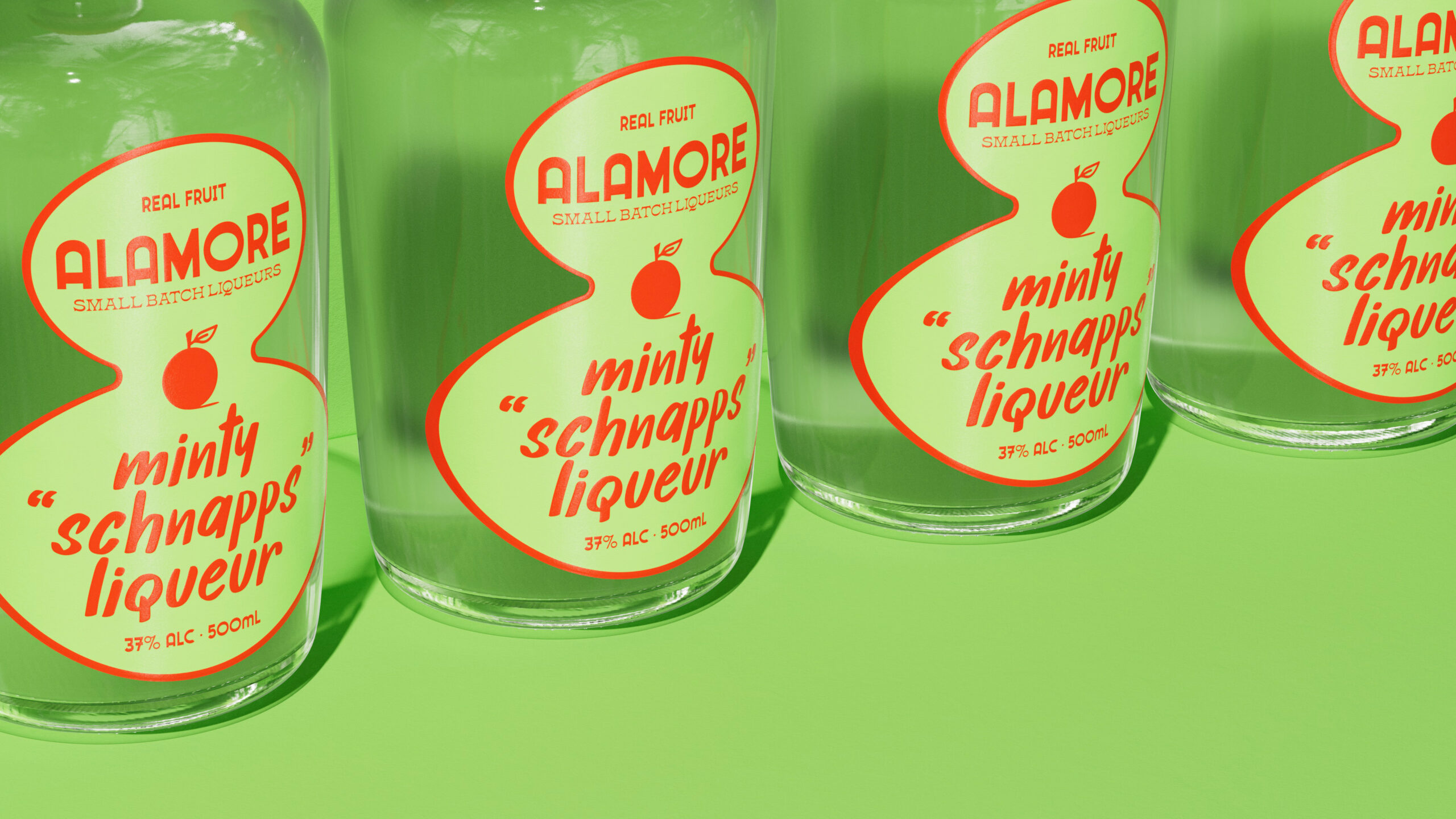
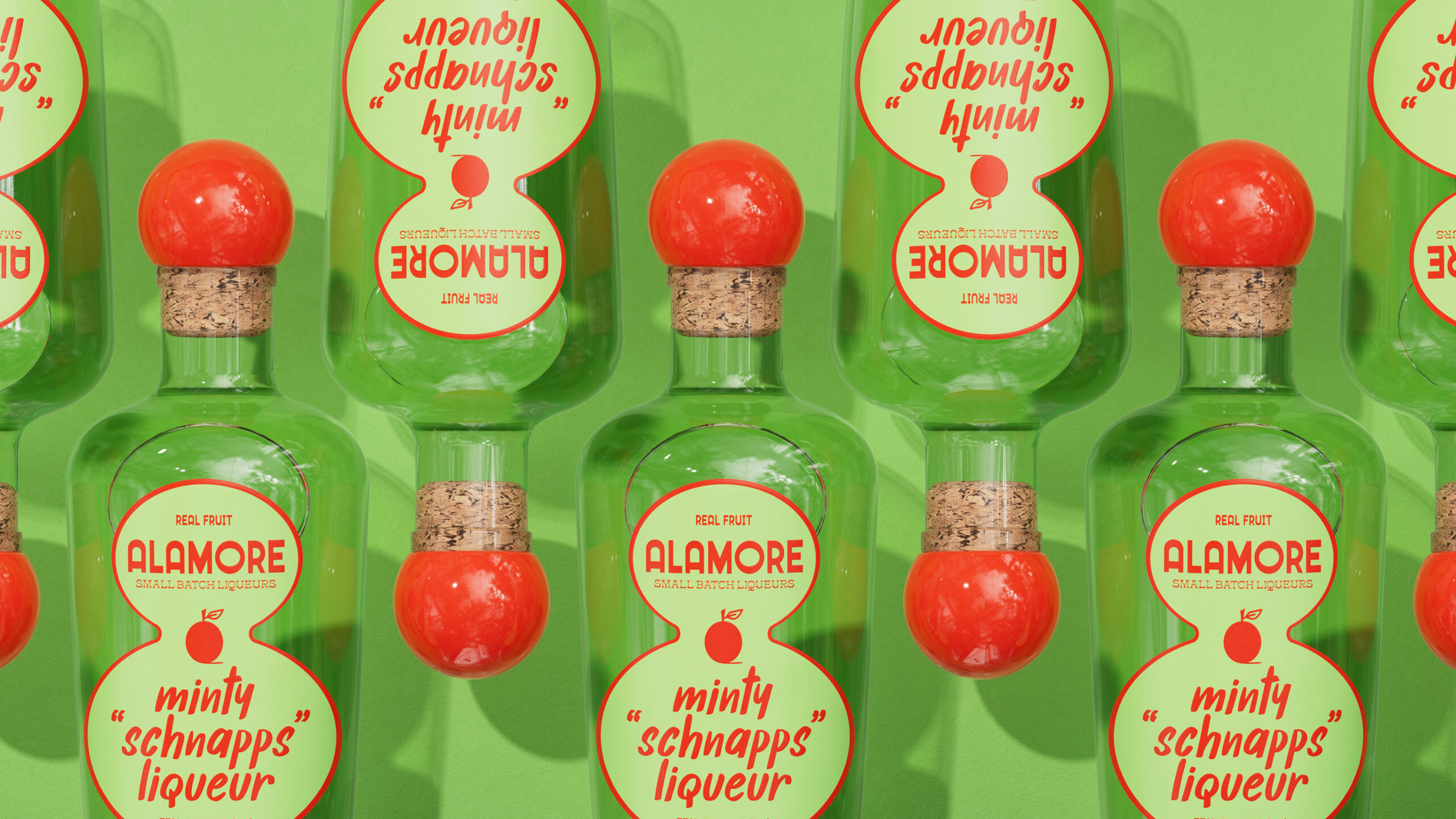
In keeping with our reverence for tradition, we chose classic packaging formats such as corked bottles, unadorned glass jars, and glossy labels that feel like they were applied on-site. The quotation marks around the product descriptors were strategic to signal to consumers the essence of each product variant and embrace the nostalgic allure of those traditional liqueurs.
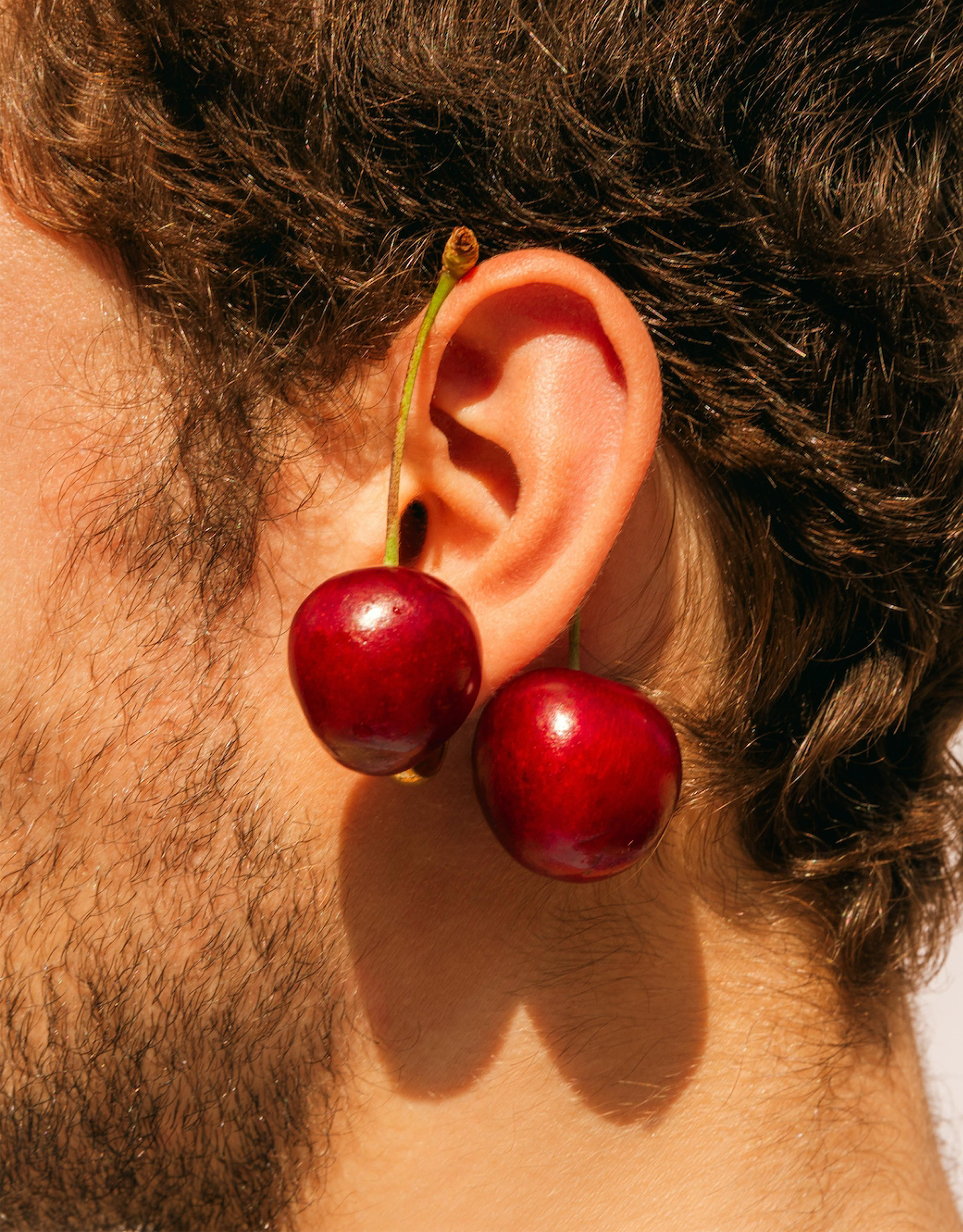
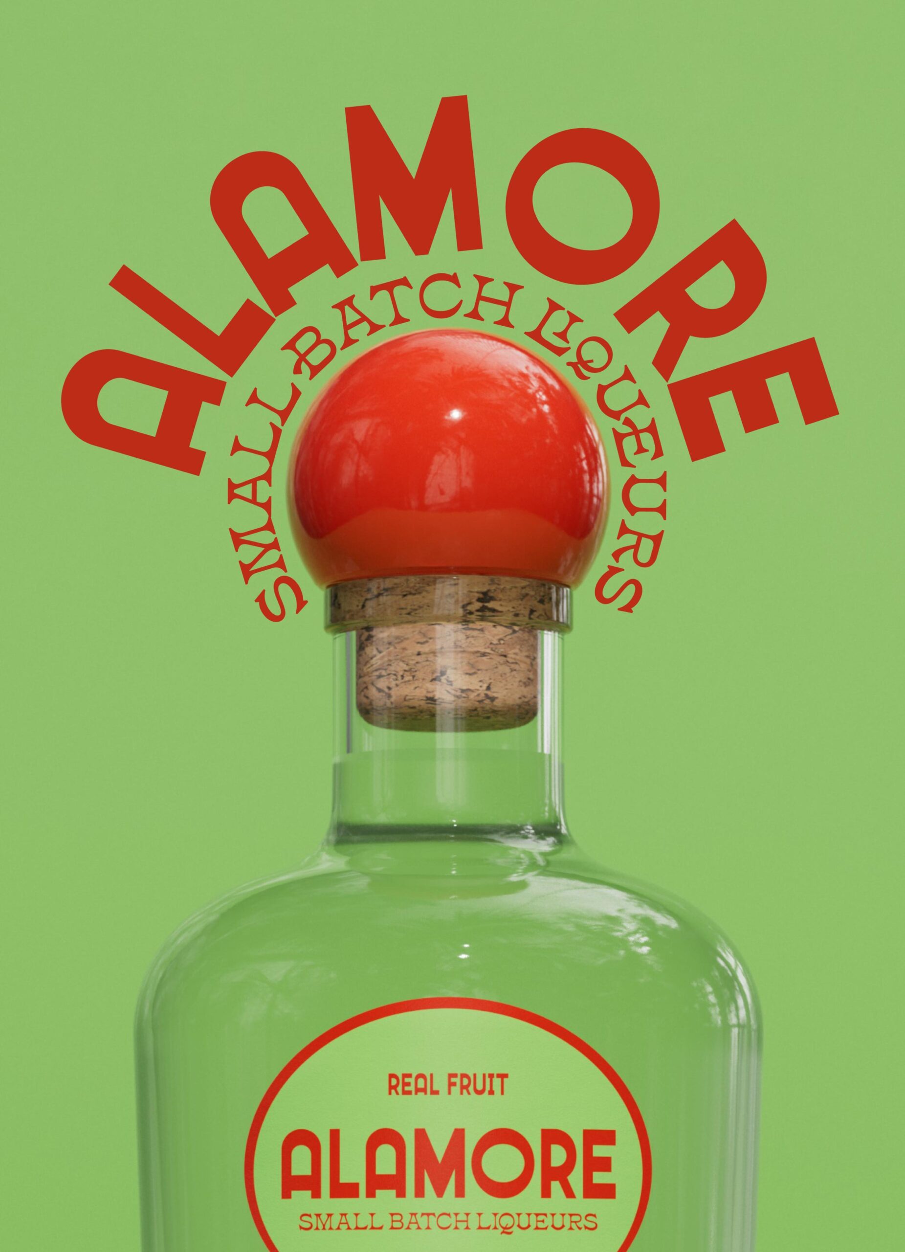
The final packaged product serves as a vessel of timelessness and heritage, inviting consumers to partake in a sensory and sweet journey. Yet amidst this homage to tradition, there exists a touch of whimsy—a shiny red orb cap, an unmistakable symbol of our brand identity. Inspired by the concept of “a la mode,” this cherry-esque cap serves as a playful nod to the dessert liqueurs within.

more projects


